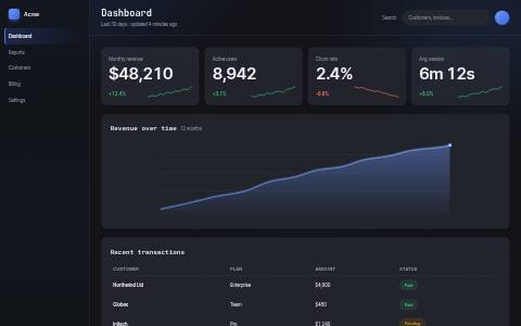
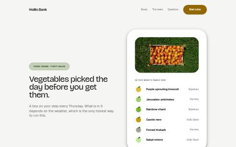
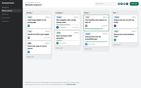
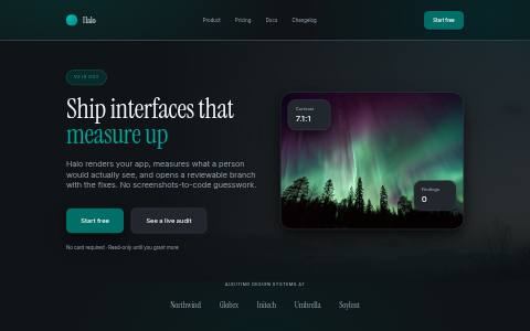
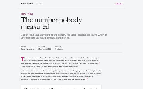
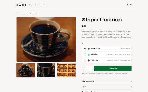
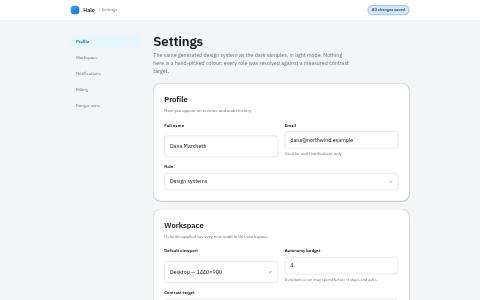
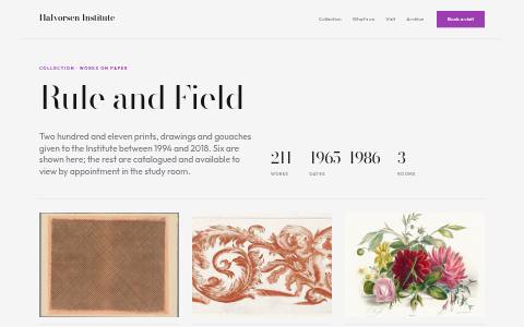
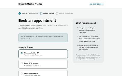
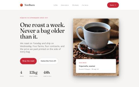
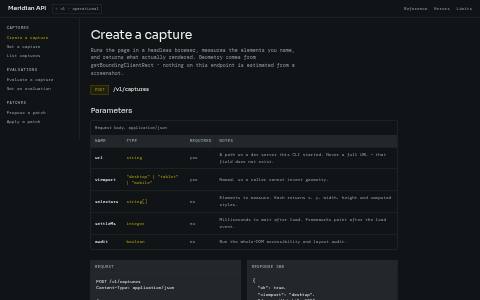
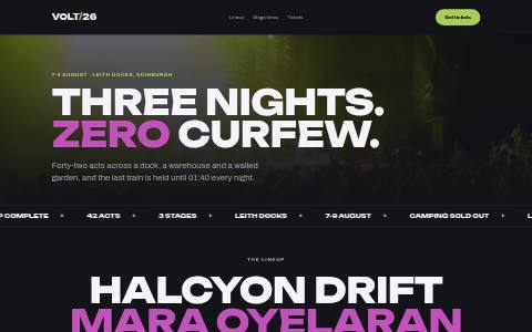
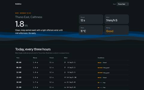
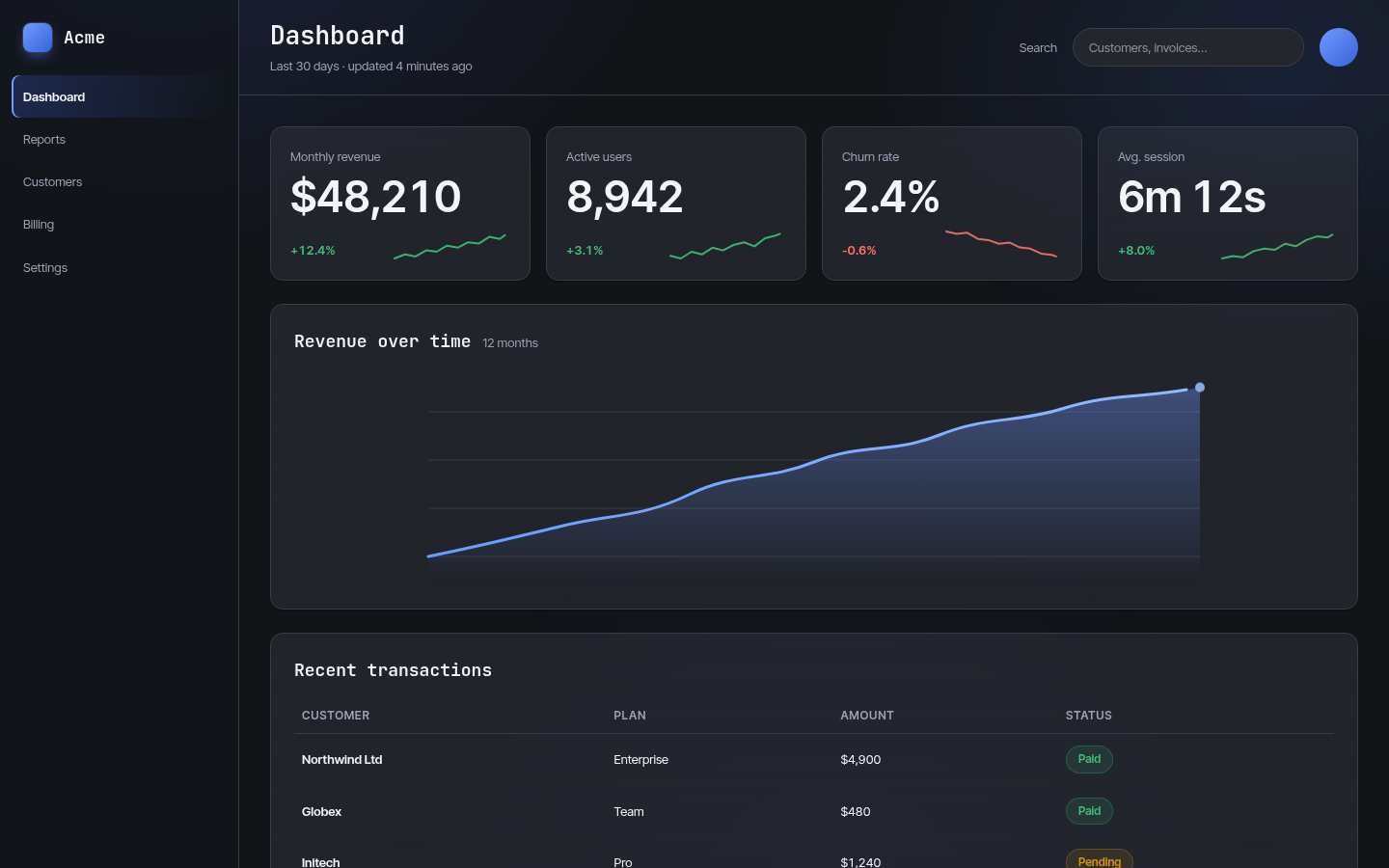
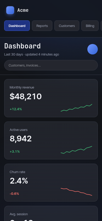
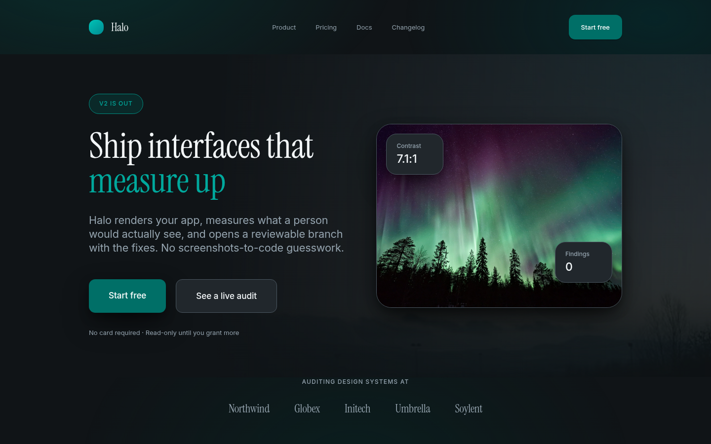
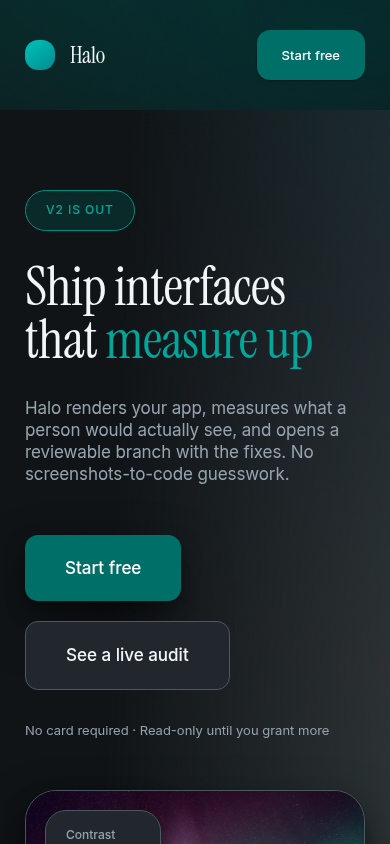
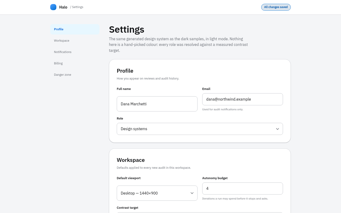
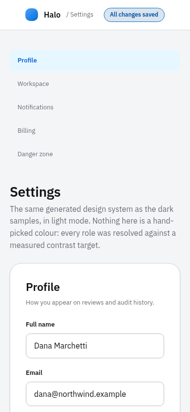
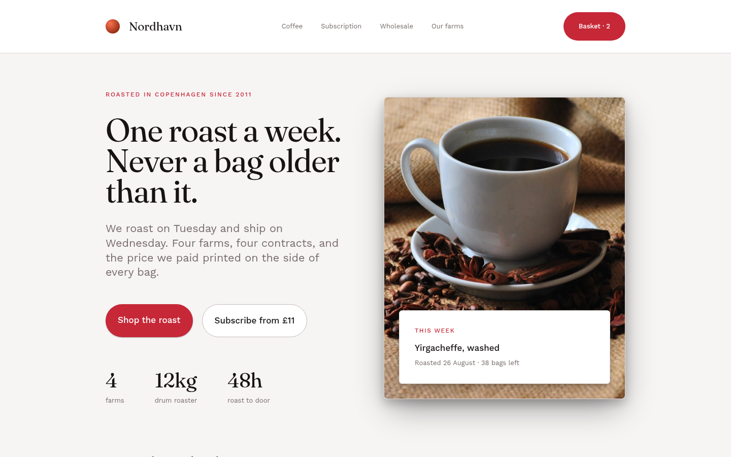
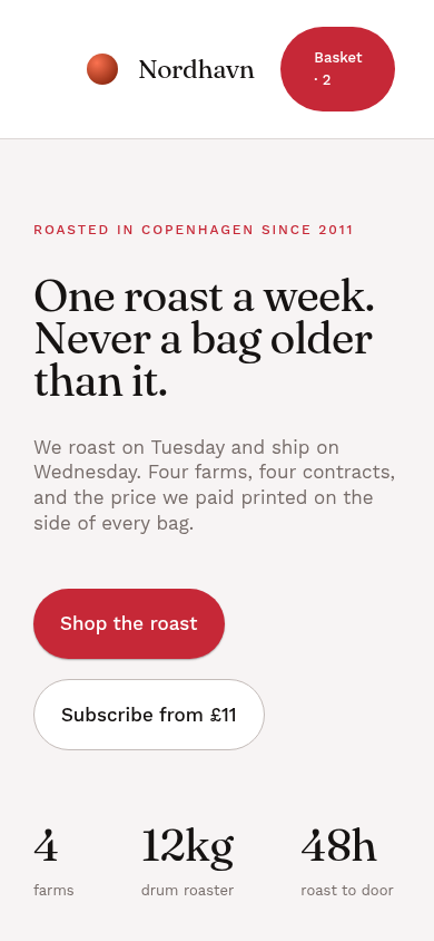
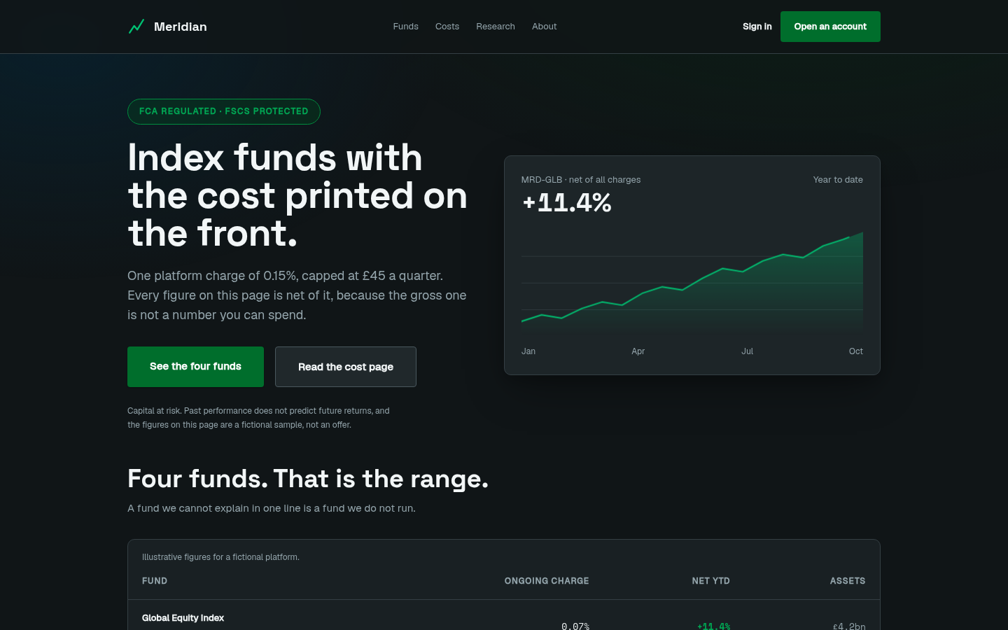
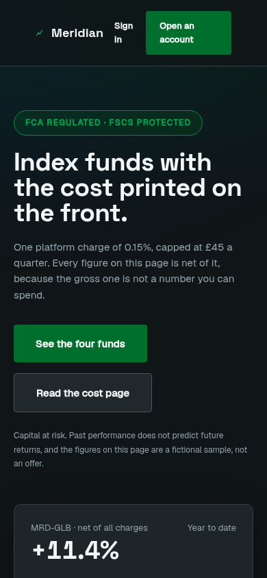
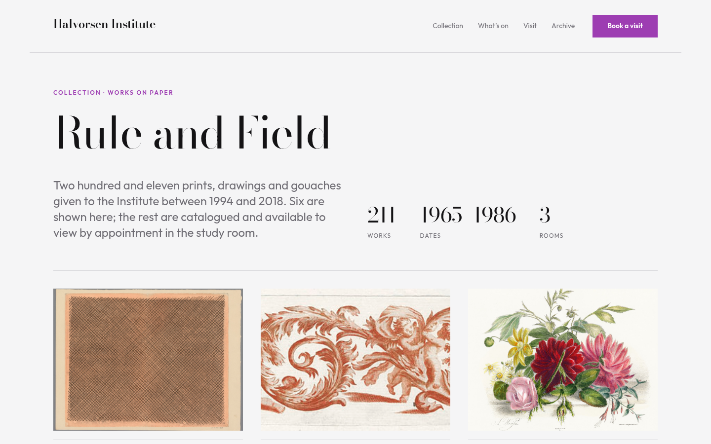
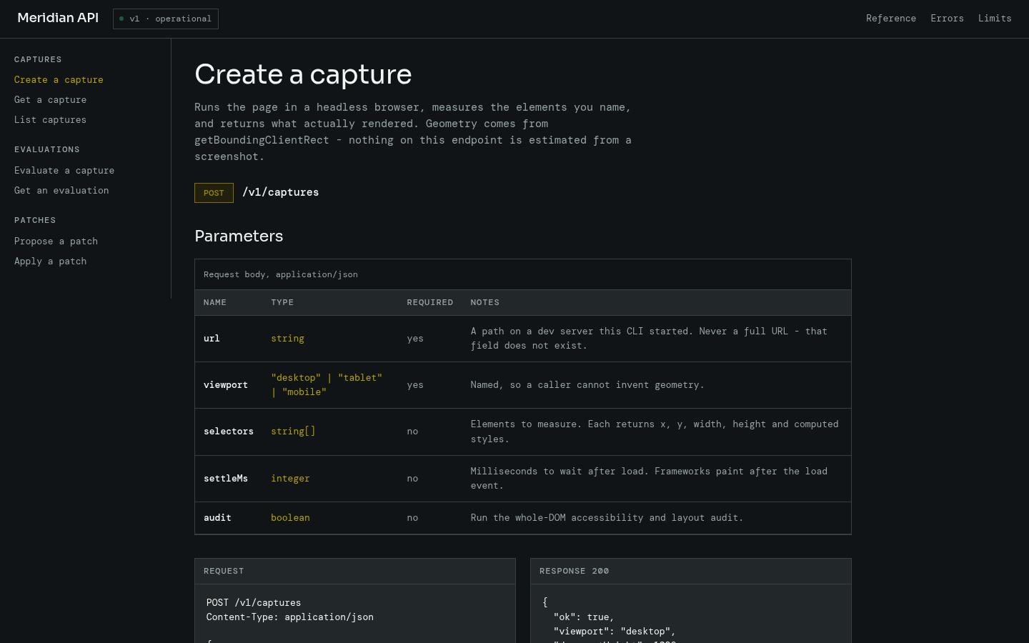
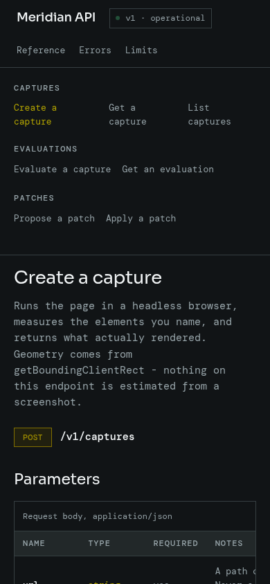
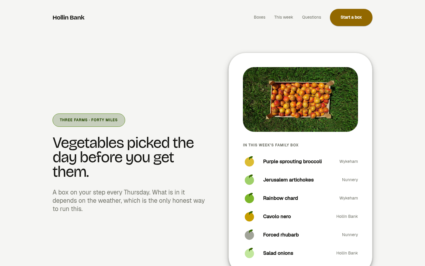
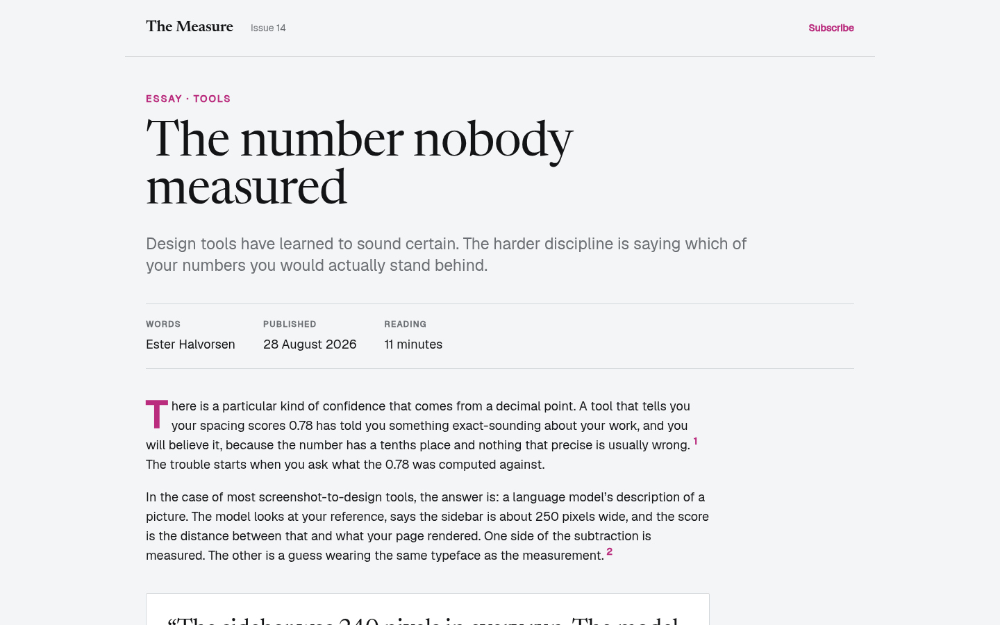
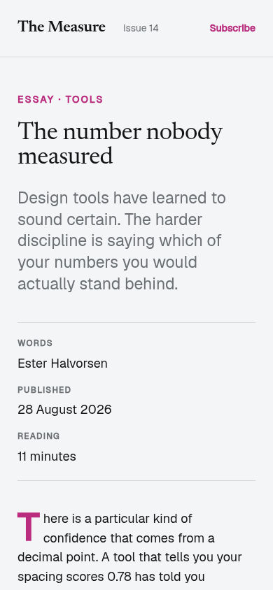
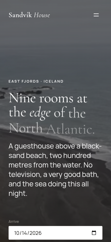
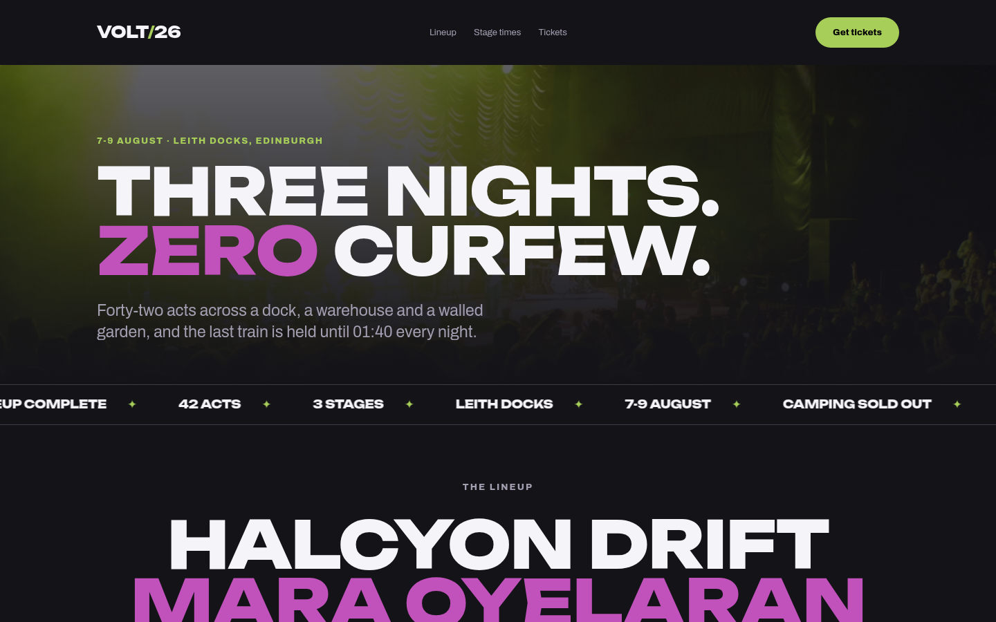
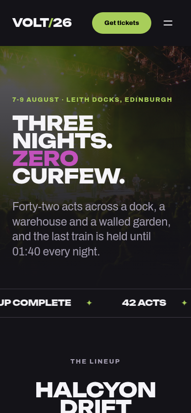
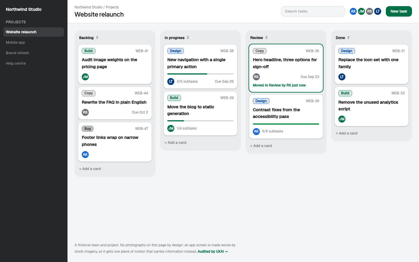
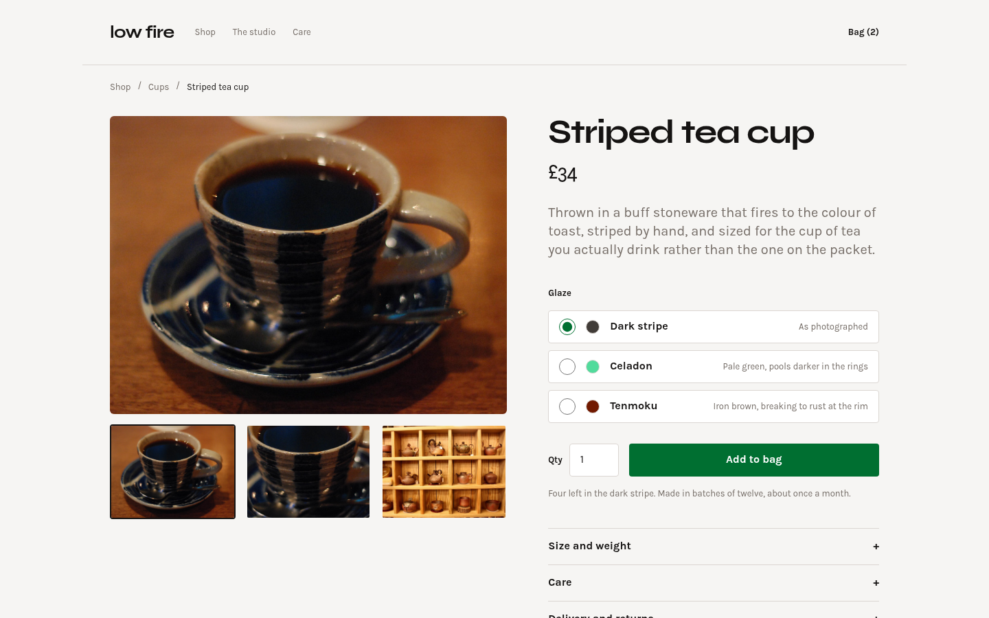
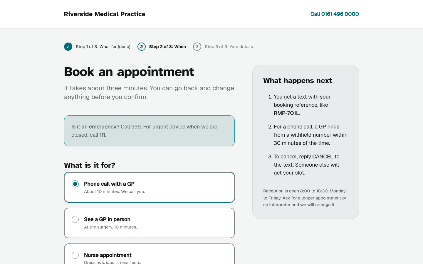
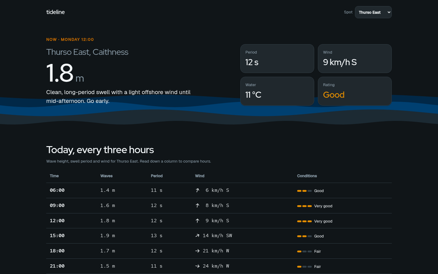
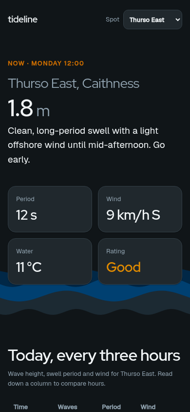
They are also not one page recoloured six times, though the first version was. Each carries its own scale: type ratio, grid unit, corner softness, shadow depth, duration. Those are the dials the design agent moves, and the figures under each card are read off the running theme rather than typed beside it.
A scale was not enough either. Probing them with this product’s own browser found every one of them rendering in ui-sans-serif — no typeface at all — five of them declaring the same fallback stack character for character, at five weights each. So each now carries its own typeface and exactly two weights, and asking for a third does not compile.
UXAI fixed the first two by itself — planned the change, edited the code, re-rendered and re-measured, stopping when nothing measurable was left. Both arrows below are real before-and-after measurements.